LATEST:
The great dinosaur escape
centre for life - Newcastle
-
Design and develop logo and branding for new Dinosaur exhibition, including a trail with clues
-
Ensuring legibility, accessibility and understanding throughout all designs
-
Interpretation panels
-
Gallery signs and backdrops
-
Large scale information wall graphics
-
Screen graphics
-
Printed DL size leaflet design
-
Sticker and badge design
-
Warning signs and trail clue graphics
Design & Display : AFSB
Graphics & visual communication: Charlie Feast
Dinosaurs: Dinosaurios, Mexico
Curators: Centre for Life team
Build: Craig Currie Ltd
Graphic Contractors: Bigger Scene + Displayways
Photography AFSB & Life.org


The Story of Life
Centre for Life, Newcastle
-
Designed and delivered a 25th anniversary exhibition showcasing community impact and research milestones
-
Developed full visual identity including colour palette and typographic treatments
-
Enhanced archival imagery with black and white edits and bold graphic accents
-
Created immersive 360° display using double-sided panels and layered elements
-
Collaborated with internal team through concept development and approvals
With thanks to the work of the team at Life
Design: AFSB
Graphics & visual communication: Charlie Feast
Build: Paul Case/The Hub
Graphic Contractors: Display Ways


ARCHIVE:
LIGHTBOX
Centre for Life, Newcastle
-
Lightbox is a new visitor experience located within a former gallery space at the Life Science Centre.
-
The brief was to transform the redundant area into a fully interactive environment featuring hands-on exhibits that encourage exploration and discovery of the principles of sound, light, and water waveforms.
-
Developed branding and logo design for the exhibition, inspired by wave forms
-
Designed exhibition panels and image walls, using colour coding to differentiate themes: water, sound, and light
-
Selected neon colour palette to reflect the gallery’s technical and electronic focus
-
Created a bold, custom title font to complement the gallery’s atmosphere
-
Conducted multiple logo iterations to ensure thematic alignment
TEAM:
Design: AFSB
Graphics & visual communication: Charlie Feast
Illustrations: Sharon Armstrong
Build: The Hub
Graphic Contractors: Display Ways
Science Exhibits: Hüttinger Interactive Exhibits, Germany
String Wave: Paul Friedlander
Water Play: Pre-Loaded
Photography courtesy of life.org


Playzone 2024
Centre for Life, Newcastle
-
Gallery was designed exclusively for children aged 7 and under, alongside their accompanying adults. Using the North East as inspiration, we created large-scale murals that wrap around the three walls of the space, each illustrated in a distinct style.
-
Designed all exhibition walls with distinct visual styles
-
Created a fully illustrated wildlife-themed wall
-
Developed a collage-based image manipulation wall
-
Produced a wall combining photographic effects with illustrated cartoon elements
Graphics and illustrations work
Graphic contractor - Displayways
Main and bespoke build - The Hub


Contemporary Science hub
growing our future
-
Using the pop up exhibition system we created for the science centre in 2022 and reconfiguring the layout this Contemporary Science show provides the visitor with a window into how nature effects the way we live and how it inspires us to create a way forward in the future.
-
Designed entire exhibition using existing panels and furniture, collaborating closely with team for approvals
-
Developed placard designs using varied techniques to create clear, impactful, and easily readable messaging
-
Maintained consistent brand philosophy across diverse panel shapes and formats to ensure cohesive storytelling
Graphics and illustration work
Mushroom model by Richard Graham Make-It London
Graphic contractor Displayways
Images: Shutterstock


Brewhouse Yard Visitor Experience, Nottingham
-
Across the centuries of Brewhouse Yard from 1900s & back in time to 1650s the visitor discovers the history behind the cottages & their relevance as a key centre for Nottinghams renowned textile industry, guided by our 12 year old narrator.
-
Developed the overall brand identity for the castle exhibition
-
Illustrated the narrator character for interpretive storytelling
-
Designed and produced authentic-feel notebooks and scribes for visitor interaction
-
Researched and created branded labels for bottles and other objects
-
Created fabric print sets, ensuring legibility and harmony within the space
-
Designed eye-catching branded labels to enhance visitor engagement
TEAM:
Room design, layout & set dressing AFSB
Graphic Design and Interpretation Charlie Feast
Historian Susanna Austin
Set works by The Hub
Graphic contractor Displayways
Artistic painter Jonathan Monk
Window graphic and installation Print4


WOW gallery
CFL
-
A new and exciting hands-on interactive gallery in Newcastle for 2023.
-
Featuring 16 new interactive exhibits underpinning many areas of science and technology.
-
Designed the gallery logo to convey its concept and atmosphere through typography and colour palette
-
Developed exhibition panels with clear, impactful messaging while maintaining brand consistency
-
Applied colour coding to differentiate thematic aspects throughout the space
TEAM:
Centre for Life team
3D Design Andy Feast & Sharon Beard - AFSB Associates
2D Design Charlie Feast - AFSB Associates
Illustrator Sharon Armstrong - Sharon Armstrong Creative
Content Ben Gammon - Ben Gammon Consulting
Consultant Heather Mayfield
Access Consultant Katie Gonzales-Bell
Exhibit Makers Science Projects, London & Hüttingers, Nuremberg.
Lighting Jonathan Howard - DHA Designs
Contractor - The Hub Limited
Graphics Contractor - Displayways


SCience now! Save the bees!
CFL
-
Applied diverse graphic techniques to create eye-catching, easily understood designs
-
Utilised textures to convey specific information quickly and effectively
-
Developed a set of illustrations to visually explain complex content
-
Produced cohesive work across both digital and print media
3D Design: AFSB Associates
Contractors: The Hub Limited


Pop-up play
CFL
-
Brief was to develop a concept to engage young visitors in playful science experiences at the Centre for Life. Designed a suite of three interactive pop-up play areas, prioritising exploration and hands-on learning over formal education
-
Designed logo to evoke a sense of wonder and developed a colour palette linking interactive zones
-
Created basic layout and typography, ensuring clarity, legibility, and consistency across all materials
3D Design: AFSB Associates

Architects: AFSB Associates Contractor Jeff Davies at TMP Ltd


Architects: AFSB Associates Contractor Jeff Davies at TMP Ltd
Creativity Zone
CFL
-
To create a new exciting area and change the existing makers studio within the centre stood large and slightly awkward within its piece of architecture, looking more house than factory and providing a more school classroom vibe than a making one.
-
Developed the brand identity for the area using a bright orange colour scheme to capture attention
-
Designed engaging small-format info and facts to maintain visitor interest
-
Applied contrasting textures and colours for bold yet creative visual impact
-
Created large black-and-white cut photos wrapped around pillars for a 360° immersive experience
-
Designed textured large-print typography on tables with prompted words to inspire creativity
3D Design: AFSB Associates

Architects: AFSB Associates Vinyls: Bigger Scene Contractors: The Hub Limited


Architects: AFSB Associates Vinyls: Bigger Scene Contractors: The Hub Limited
Final Major project
-
Final university project brief: Develop your own brief and deliver a final product.
-
During COVID, through research and listening to music, created “Nothing Great About Britain”, inspired by an album I was listening to at the time.
-
Originally planned as a walk-through book exhibition, the project shifted due to COVID, with the second half of my final year completed remotely. The outcome became a book and film serving as a social commentary on Britain, exploring both its positive and negative aspects.
-
It runs through topics such as the environment, cultures and COVID-19.
-
Applied a wide range of graphic techniques while maintaining cohesive design and legibility
-
Utilised textured and layered typography, film and digital photography, and multimedia graphics
-
Integrated structured information and visual storytelling to create a book and film capturing the essence of Britain


D&AD LIVE BRIEF
-
Completed alongside my Final Major Project in my final year at university
-
Brief: Select a song, genre, or musical movement representing a cause and express it through typography
-
Chose “Boys Will Be Boys” by Stella Donnelly, responding to the #MeToo movement
-
Developed a cohesive typographic campaign including:
-
Poster
-
7" publication
-
Short film
-
12" vinyl record with gatefold sleeve, inner lyric sheet, and inner sleeve
-
All elements produced using tracing paper to symbolise the emotional layers involved in rebuilding after trauma


Critical Research and Response
-
Developed alongside my dissertation exploring: “How is the contemporary magazine industry surviving in contemporary society?”
-
Conducted in-depth research into modern publishing, audience behaviour, and print culture
-
Designed and produced Weekend — an experimental typography and contemporary magazine focused on the weekend
-
Created as a response to my findings, proposing a magazine concept built to thrive in today’s industry


monotype
live d&ad brief
-
Brief: Create a typography-led integrated campaign celebrating a community beyond the usual expectations
-
Explored the music and record-collecting community
-
Identified a decline in visible community spaces for music enthusiasts
-
Created RPM Sound — a concept community reconnecting people through a shared love of music
-
Designed a series of typographic posters promoting the initiative, turned into Handmade Japanese / stab binding book
-
Supporting Instagram: @rpmsound_45


The Editorial Process ORIGIIINALS
-
The Editorial Process began with forming a collection of 12 items with the project emphasising experimentation throughout the process and final outcome required both a website and a publication (minimum 16 pages)
-
Interactive platform showcasing the trainer collection
-
Features a video composed of photographic content of people wearing the trainers and includes GIFs of illustrated/cartoon versions of the trainers
-
A photo book format, combining visual content with data and research, exploring the psychology of collecting
-
Strong use of constrained layout systems
-
Consistent and deliberate typographic rules
-
Incorporates a range of photography techniques
-
Balances structured design with experimental visuals
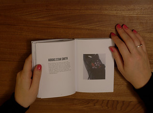
The editorial
process
The Editorial Process is a project that started with forming a collection of 12 items. I started with a collection formed of 12 pairs of Adidas Trainers. The project had to be full of experimentation and the end product had to include a website and a publication of at least 16 pages.
This was to be named ORIGIIINALS.
The website includes a featured video full of photographs of people wearing the trainers and gifs of cartoons of the trainers and is an interactive site that can be used to view the collection and read information about them.
The book is a photo book that includes the data and information involved in the psychology of collection and how this Adidas trainer collection started. (January 2019)


Moving image
-
Final project of Year 1 focused on moving image
-
Produced:
-
Six experimental 10-second trial films
-
One 30-second film based on a randomly assigned story (including a self-built set)
-
One final poetry film
-
Initially given a poem to interpret, but chose an alternative poem to better visualise and develop a stronger narrative
-
Focused on translating written word into engaging visual storytelling

(I've Got A Brand New) Track Suit by John Cooper Clarke
Print is not dead
-
Brief: Transform one of five provided texts into a book format
-
Constraints:
-
Include all original text
-
Incorporate at least 12 images
-
Designed to be read within a confined space
-
Selected The Metamorphosis by Franz Kafka
-
Explored the theme of transformation through layout, imagery, and book design
-
Handmade Japanese / stab binding book
-
Each page folded and cut by hand, some pages revealing illustrations inside them


Foundation
final major project
-
Photographic narrative project documenting my generation
-
Concept evolved throughout development to reach a refined final outcome
-
Captured candid, off-the-cuff imagery using:
-
Polaroid instant film
-
35mm colour and black & white film
-
Digital cameras and phones
-
Explores everyday life within current age group
-
Created in the lead-up to a general election, reflecting on youth perspectives, politics, and the future of the country


dampack
-
Created during foundation course following a research trip to Amsterdam
-
Documented the trip through drawing, photography, and written observations
-
Brief: Produce a zine to sell at the end-of-term UCA fair
-
Initial concept evolved from illustrated photo overlays to a new direction
-
Developed Dampack — a custom-designed pack of playing cards inspired by Amsterdam
-
Combined illustration and collected visual research into a cohesive, themed outcome


